

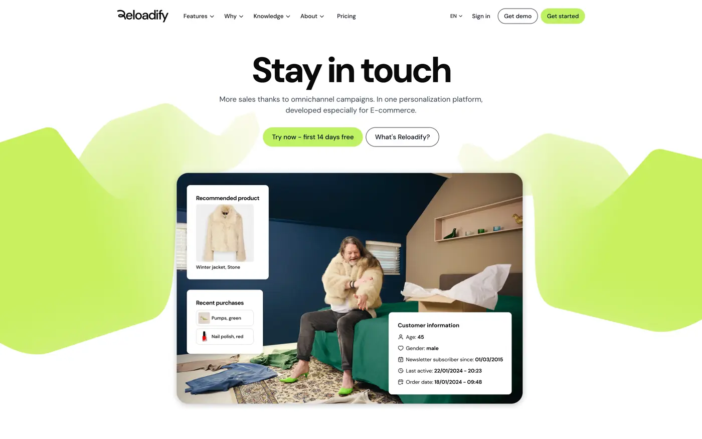
The product does a lot. The homepage can only say one thing.
Reloadify covers customer data, automation, loyalty and several marketing channels. Put all of that in the first screen and nobody reads any of it. The site had to open with what a webshop gets out of it. The capability list could wait.
- Outcome first
- Start with what the webshop gets. Technology comes up when it explains that outcome, not before.
- One visual grammar
- Audience pages, feature pages and campaign routes reuse the same patterns, so nothing has to be redesigned to feel like Reloadify.
- Light on the wire
- Pages carrying a lot of product story still had to load fast, which ruled out most of the heavier interaction options.
The brand direction became a small set of reusable blocks.
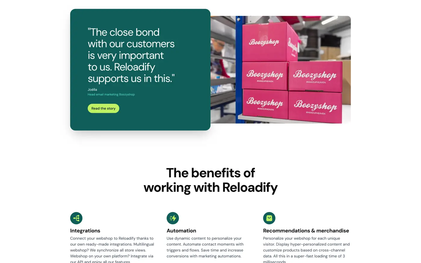
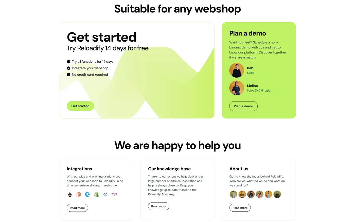
I built stable components for the opening, the proof, the product explanation and the closing ask. Marketing composes new routes out of those. Typography, rhythm and behaviour stay put because they live in the components rather than in each page.
- 01 Promise
What the webshop gets, inside one screen.
- 02 Proof
Customer results, close enough to the claim to carry it.
- 03 Product
Capabilities in patterns the visitor already saw further up.
- 04 Next step
One ask at the end. The same ask on every route.
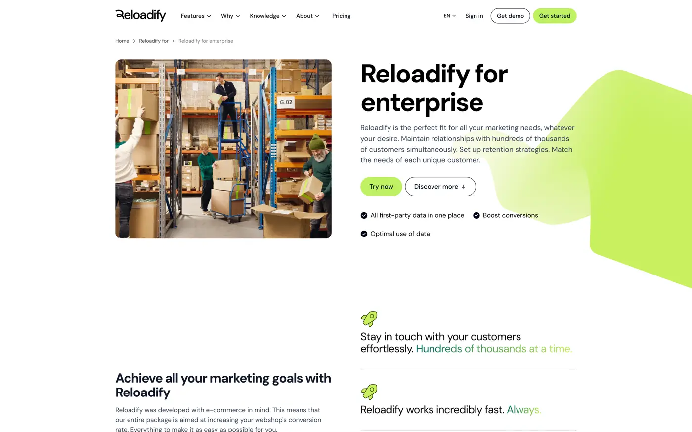
Same blocks, different story.
Pricing, audience pages, culture and customer stories all run on the modules. What changes is the content and the order, not the code behind the route. That is what kept a bespoke template per page out of the project.
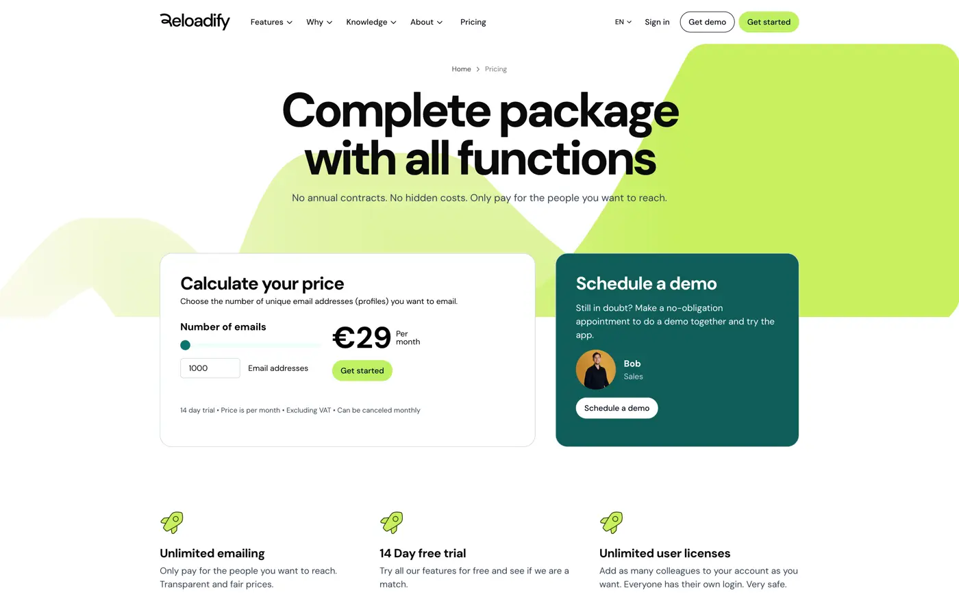
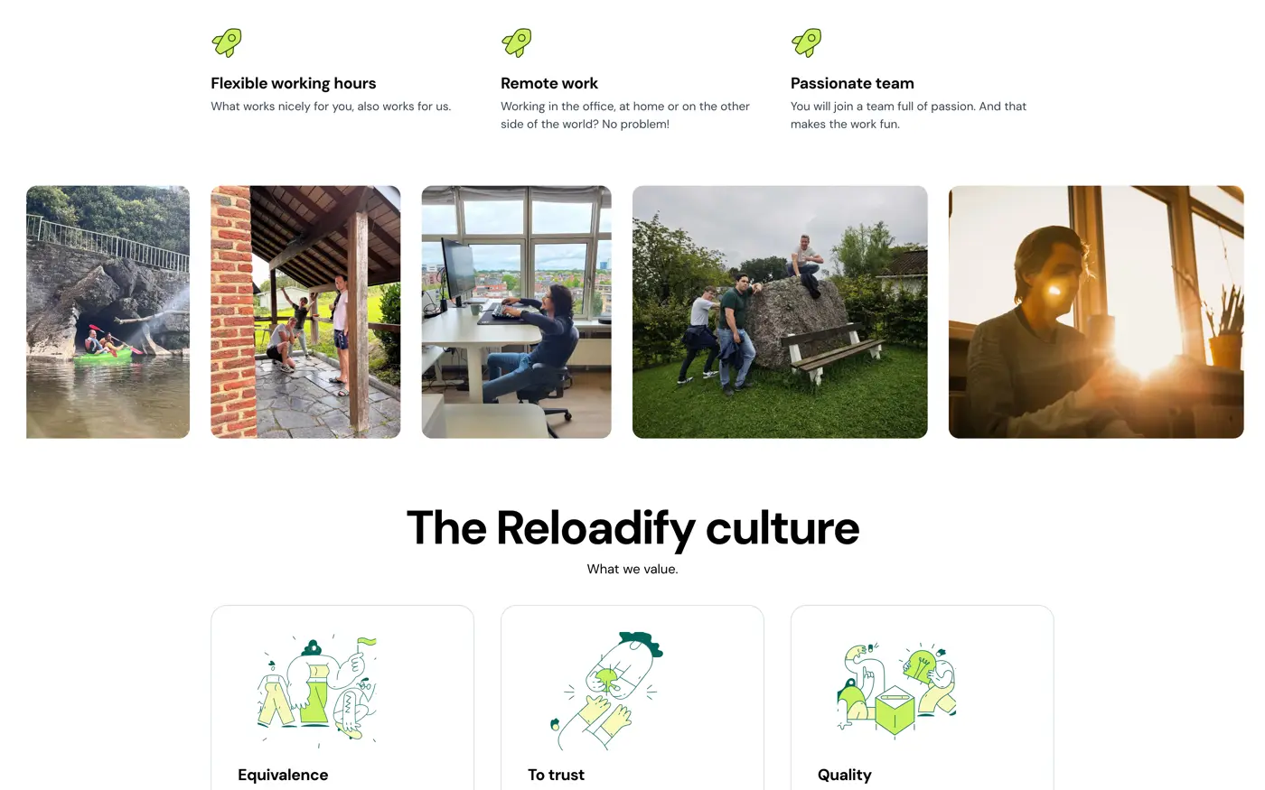
New pages without a development ticket.
The promise reads clearly from homepage to sign-up. And marketing puts a campaign page or language variant live without a development ticket.
- Modular
- One component system for marketing pages
- Multilingual
- One structure across language variants
- Reusable
- New routes without bespoke components
Building one good-looking page is not hard. Setting rules that keep page fifty good is the actual work.
Design came from Martijn Runia, branding from G2k. My part was the translation: a responsive front end, the module system, the multilingual structure and an implementation marketing could pick up on a Tuesday afternoon without calling me.